Colour describes; black and white reveals
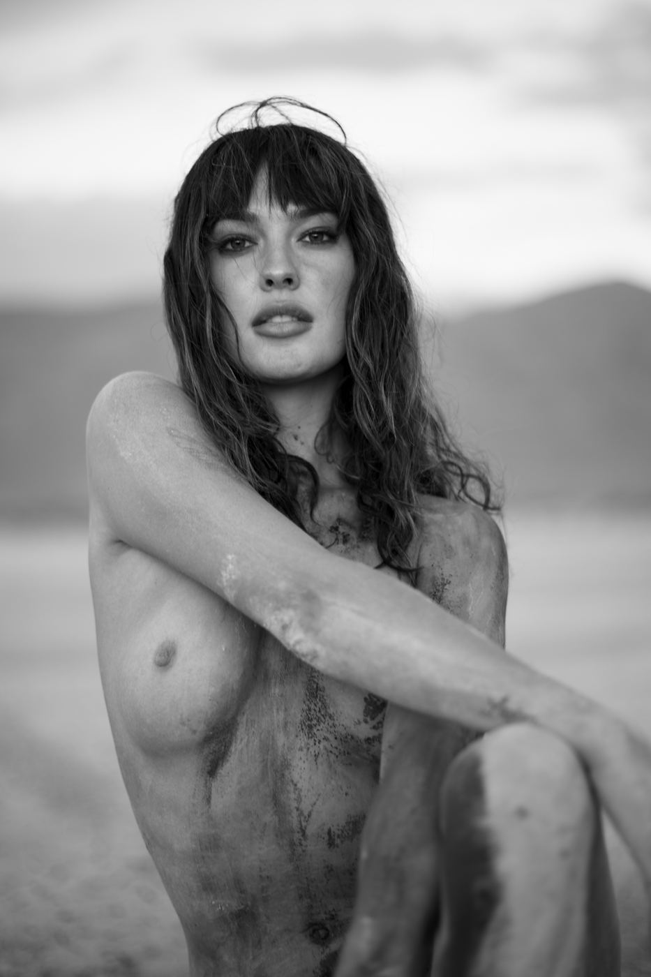
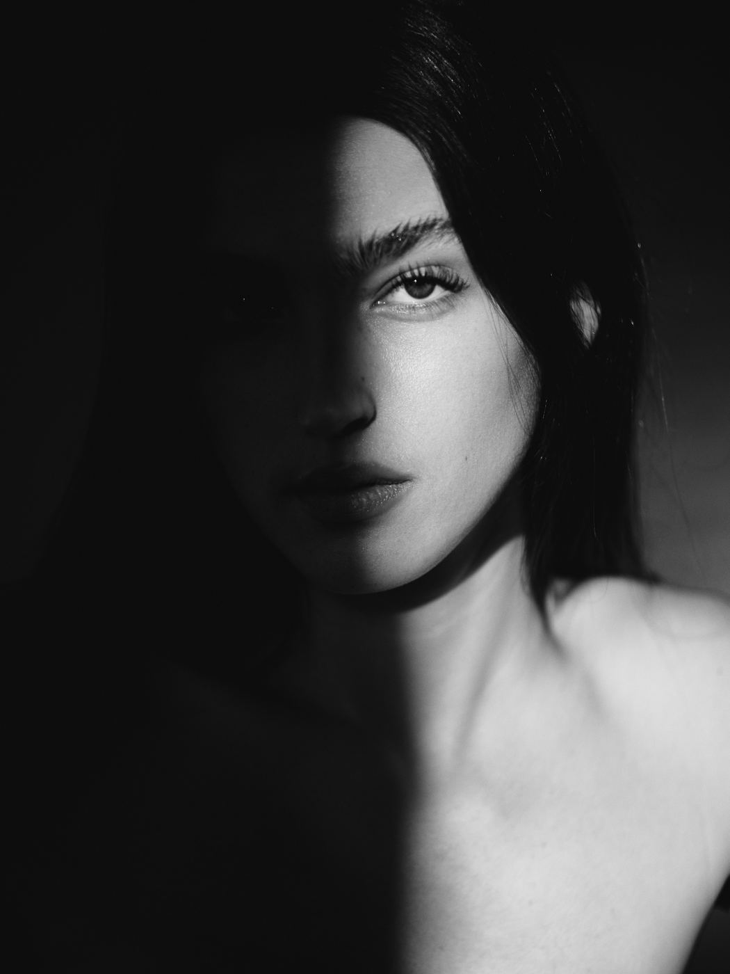
A colour photograph tells you what someone was wearing, what the weather was like, what year it probably was. It is full of information, and most of that information is about the surface of things. Take the colour away and what is left is shape, light and expression, which are the three things a portrait is actually made of. Nothing distracts from the face. The eye goes where the light goes, and the light goes where I put it.
I noticed this early. The first portraits I made in 2010 were in colour because that is what the camera produced. When I converted a few to monochrome to fix a colour problem, they were better, not marginally but obviously. The people in them looked more like themselves. I have been trying to understand why ever since, and I think it comes down to this: we do not remember people in colour. We remember a look, a gesture, the set of a jaw. Black and white is closer to memory than colour is.
What it does to skin
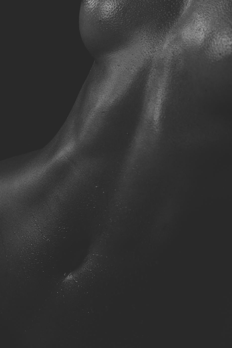
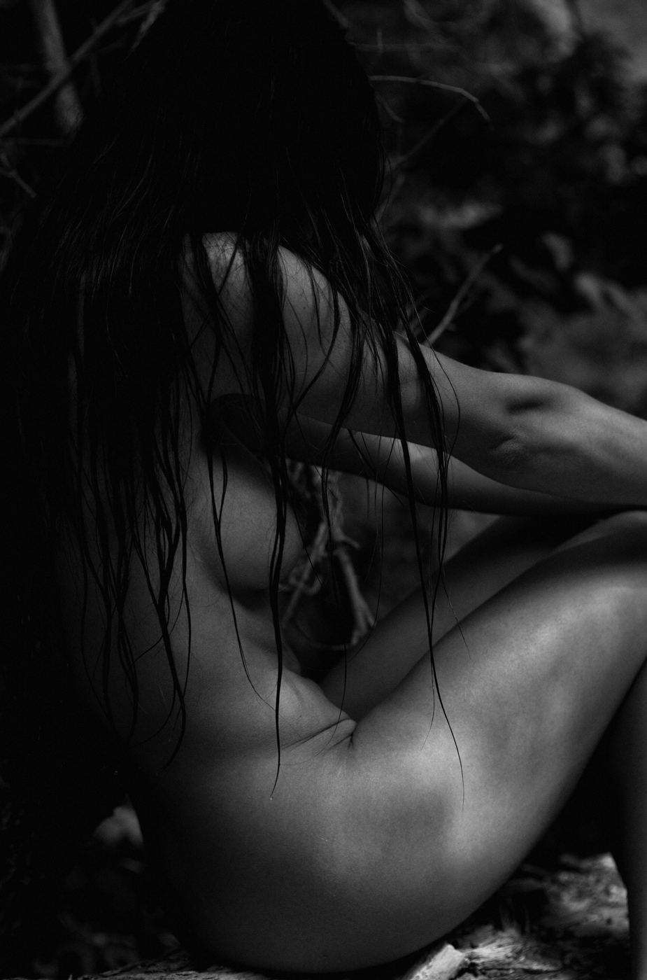
This is the practical reason for most of my fine art and beauty work. In colour, skin is a colour problem: redness, blotching, veins, tan lines, the yellow of one light against the blue of another. Half of colour retouching is fixing colour. In black and white all of that disappears and skin becomes texture and tone, a surface that light falls across. A scar is a line. A stretch mark is a highlight. The marks that people hate in colour become, in monochrome, the interesting part of the picture.
It is also kinder without being dishonest. It does not hide anything; it simply stops the eye from sorting flaws by colour. People who have spent decades avoiding cameras see themselves in black and white and say some version of "oh, that's me". That reaction is why I do this.
What it does to a place
Utah is a colour landscape: red rock, white salt, blue sky, gold aspens. Everyone photographs it that way and the result is a postcard. In black and white the salt flats become a white plane and a grey sky, and a figure on them becomes a mark on paper. The red rock becomes form: shadow, edge, weight. It is less pretty and more true. It also stops the landscape from competing with the person, which in a portrait is the whole point.
What it does to a brand
A black and white campaign in a colour feed stops the thumb. That is a cheap observation, and it is also true, and every art director knows it. The deeper thing is that monochrome signals seriousness. It says the brand is confident enough not to shout. For a skincare brand, it says the product is about texture, not colour. For a founder portrait, it says this person is thinking rather than selling. Not every brand can carry it. I tell campaign clients honestly when theirs cannot.
It ages better
A colour portrait from 2012 looks like 2012: the colour grading of the period, the fashion, the specific orange of the filters everyone used. A black and white portrait from 2012 looks like a person. I want the photographs I make to work on a wall in thirty years, and monochrome is the closest thing I have to a guarantee. It is also why the ones on my parents' mantel, made by a studio photographer in the 1970s, still look good and the colour snapshots beside them do not.
When colour wins
I am not a purist and it would be dishonest to pretend otherwise. Colour wins when colour is the subject: a lookbook where the garments' colours are the point, a beauty campaign for a lipstick, a hair colourist's portfolio. Colour wins when a client wants it, because it is their photograph. And colour occasionally wins on the salt flats at dawn, when the whole world goes pink for four minutes and refusing to record it would be stubbornness rather than principle. I shoot RAW, so every image exists in both, and I deliver colour whenever it is asked for. I simply lead with black and white, because it is what I believe in and what I am best at.
How I convert
For anyone technical: I do not shoot in a monochrome mode and I do not use presets. Every conversion is done by hand in Lightroom and Photoshop, adjusting the luminance of individual colour channels so that skin, fabric and background separate properly in tone. A red shirt and a green background might be identical mid-greys in a lazy conversion; done properly, one goes dark and the other light and the picture has depth. Then dodging and burning, the old darkroom moves, to lead the eye. A single portrait conversion can take an hour. That is the job.
What this means if you book a session
Expect black and white. Dress for it (the preparation article explains how). Trust that the marks you are worried about will become texture. And if you want colour, ask; you will get both. The portrait page explains how a session runs.